In 2019 I painted my living room a colour I can only describe as the inside of a solicitor’s waiting room. I procrastinated having people over for three weeks staring morosely at the walls telling myself they were “sophisticated” until I eventually accepted they were just jaundiced. It was a warm greige, one of those trendy paint colours with a name like Skimming Stone or Elephant’s Breath that look so worldly and mature swatched on the little cardboard tiles the DIY place have. But you know what they say about swatches… I didn’t swatch it. Properly. Did one line on the chimney breast, looked at it under the closest hallway lamp (which is basically shop lighting for tile purposes) at about 4pm on a Tuesday when I got in from work, decided “calm” and rollered the whole room over a rainy weekend while my carpet sat there, as carpets do.
Light brown carpet isn’t a background colour people.
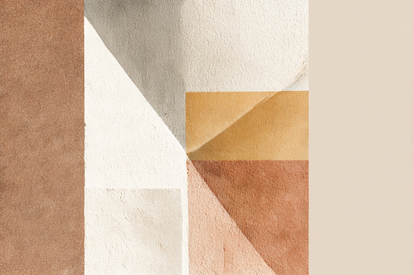
I’ll explain why in a second, but first: the carpet. It was a builder’s grade light brown carpet that had come with the house when I bought it, survived two cats and approximately a million disasters inflicted by one extremely destructive toddler friend who I still haven’t forgiven enough. It has actual history in that room, so painting stuff the wrong colour wasn’t the fault of the carpet. Trust me.
The problem was that I’d chosen a wall colour with exactly the same muddy undertone as the carpet so the whole room just read as one flat beige smudge with a skirting board awkwardly pretending to separate the two and my mum spending her first visit since I painted it stood in the doorway asking me if I’d run out halfway through. “Shoulders don’t blush” she said, which was rude because they didn’t even slightly resemble shoulders by that point.
I eventually repainted it eighteen months later but did it right. Like, swatches on the wall for a week kind of right. Checked them at morning and evening because this house gets fucking zero natural light until about 11am and then loses it again at 3, didn’t yell at myself about how it looked every time I came downstairs. The difference between that grey walls and the greige (sorry) was night and day and the thing is…
Light brown carpet isn’t a neutral doormat you can chuck any colour against like everyone treats it as. It’s warm, sometimes gold-toned, sometimes a slightly muddier tan depending on the pile and the light source but it needs a wall colour to lean into that warmth knowingly or pull right back from it with enough contrast to actually register as a separate colour next to it, not just a lighter version of the same dusty mud they already share. Here’s some actual wall colours.
[Light Brown Carpet]
White and Off White Walls
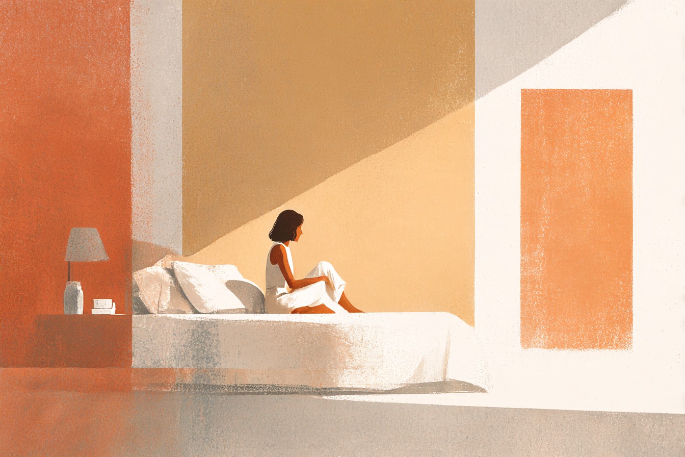
We all default to white first, myself included and it’s not a wrong choice, it just needs babysitting. Pale, blue toned white against light brown looks like they don’t like each other and I learned that lesson when I painted my spare room white. Bright, crisp “I’ll paint myself” straight out of the tin white because dollar shops and I was in a hurry to get it finished before my sister came to stay. It made the carpet look like it was reflecting actual orange by comparison, proper Technicolor orange, not warm, just bad. Swapped it for a gentle cream with just enough yellow undertone to know that actual adults had picked it and it looks so much better. Honestly, if you’re going white go warm white. Test your wall paint against the actual carpet you’re living with because a beige scrap at the DIY is never going to react with your walls the same way your perfectly nice light brown carpet will.
[White and Off White Walls]
Green Walls
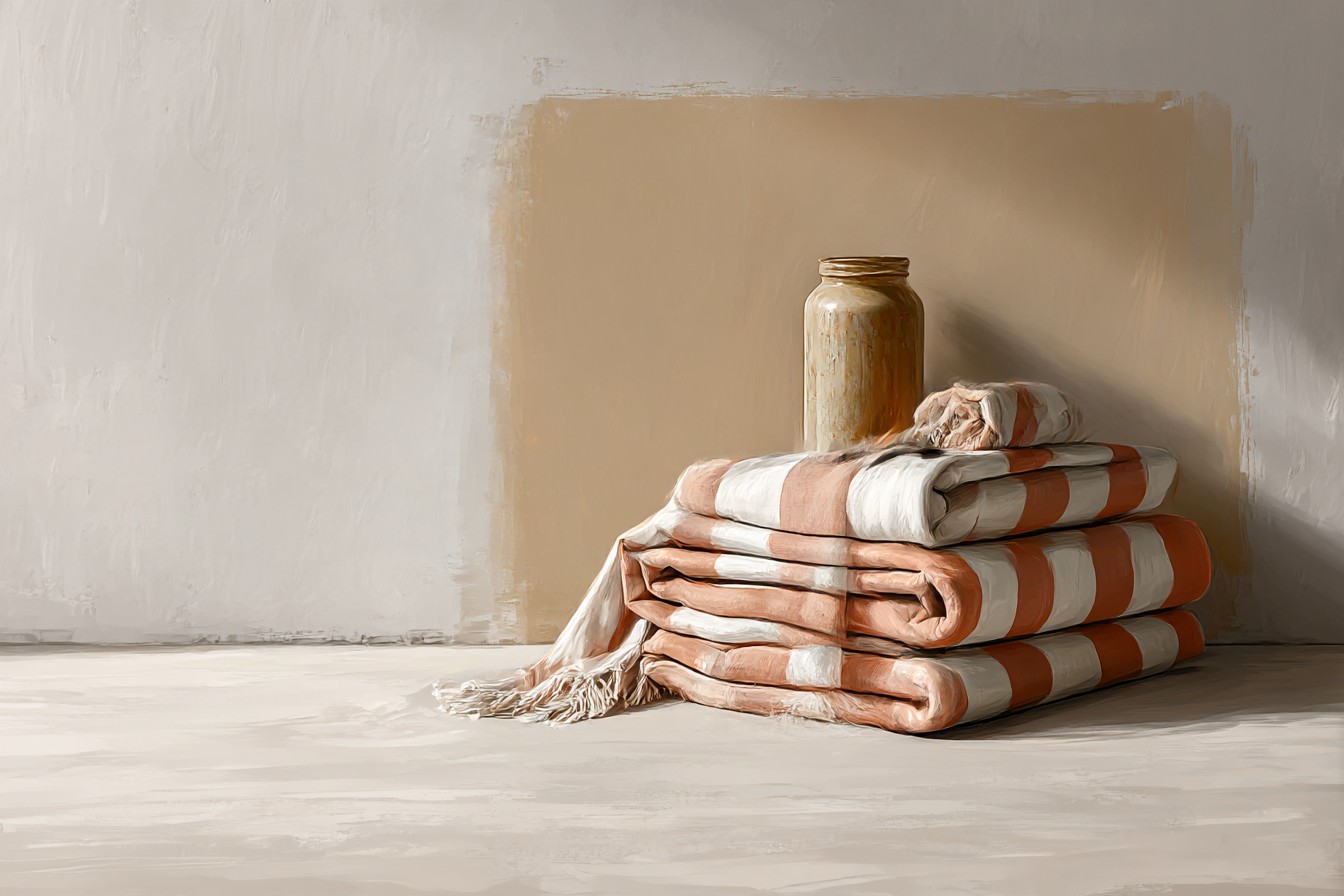
I poo-poohed green for years because of divorce related mental associations with one specific shade of forest green from around the 90s and a brass edged dado rail in my nan’s dining room but honestly, once you get past that… it rules. Muted sage, soft olive greens against light brown carpet is one of my favourite combinations now because when it’s the right tone it works; browns and greens are just family, one grows in the ground, the other is the ground it flourishes in? Stop arguing over an arbitrary line on a paint chart. I painted my classroom’s book corner a sage adjacent colour one summer (badly, don’t get me started on how rubbish I was at that) hung out all day with kids because I was rushing painting it in a poorly lit Saturday morning rush and it looked amazing. Proper calming background colour amazing, even under strip lights and next to cold grey lino. Naturally, it looks 100x better at home, against my own carpet which has actual warmth tones to it instead of the sage blue bog standard lino at school. Go bright and you’ll drown it in childhood vibes but muted and it looks high end for about a tenth of the price.
You Might Also Like
[Green Walls]
Blue Walls
I did NOT see this coming. BLUE. I would have laughed at you last year if you told me light brown carpet wasn’t bronzed by blue walls. I probably would have. Because, again…parents. We painted a wall in our baby’s nursery (her nursery, I just change things) a cornflower blue last year and the goddamn carpet sparkled. Like gold flecks sparkled. It’s a warm brown with gold in it that I can’t capture no matter how hard I try. Anyway. Something about the blue highlighted those flecks; gave the room dimension rather than everything melting into muddy mid-tone…it’s good. Bright blue and brown is a nursery/primary school tea party waiting to happen so you’ve been warned. Go deep blues; teals, navys, dark smoke and let them accentuate the colour you actually see in your carpet. Stay pale and it’ll just look cold.
[Blue Walls]
Terracotta and Rust Tones
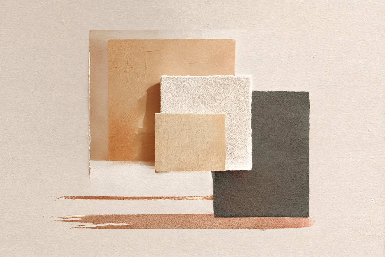
I’d probably pick this for anyone asking because brown’s nice enough with terracotta/rust that you literally cannot go wrong. Well, you could but you’d have to try. They’re neighbours on the colour wheel so instead of contrast what you get is complimentary cousins smiling quietly at each other. It looked like I’d put some effort into it when I’d painted my dining room_an off-brand Mars sitting next to light brown looks pretty damn intentional_ and my god does it ever work. It’s warm without being beige, and warm in a way that complements rather than matches your carpet. It goes wrong if you try and entire room in it… suddenly you’re the inside of a terracotta pot and that’s just not comfortable for anyone. But one wall? A smaller room? Use it as a feature and you’ll get compliments for years.
[Terracotta and Rust Tones]
Grey Walls
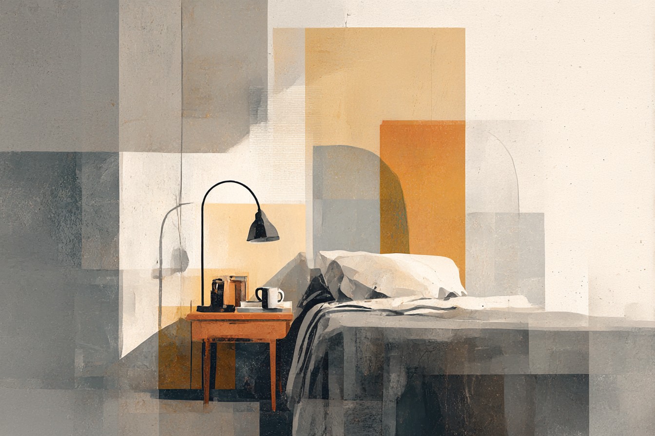
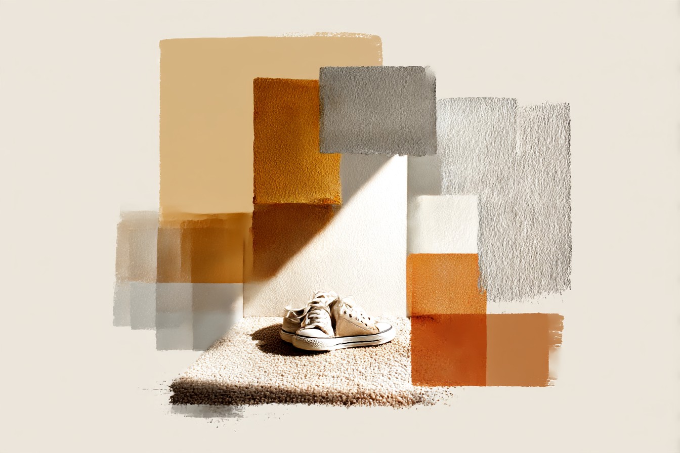
This one I would strongly advise against. I know, I know. Grey is like…the office staple wall colour of the last decade but…also no. Cool grey. Blue-grey against warm light brown is basically my greige issue except grey and everyone thinks it’s fine.
Like, I did it.
Covered my hallway in cool grey, dove grey; it’s lovely on its own but next to the carpet looked like your standard DIY gone wrong from 2007. There’s hope! Warm greys! Greys with more brown or taupe in them than azure but honestly, it’ll be anxiety inducing grey vs brown debates until you actually try them out. Test, test, test until you’ve found your grey because that specific carpet versus a cool toned grey wall is fighting for attention and we never learned how to properly get along.
[Grey Walls]
TLDR; Too Long; Didn’t Paint
If there’s one thing painting half the walls in this house has taught me about light brown carpet it’s that it’s not the beige backdrop everyone treats it as when they’re scrolling through paint samples on their phone. It has colour; oranges and golds and reds bouncing around in there that your walls need to either complement or damn well contrast so they can stand out against it. My personal ranking by ease; terracotta wins because it’s easy, green’s a seriously close second for surprising me so much, blue was my game changer, warm white if you want to be boring and mean it and grey is ONLY okay if you’ve tested the shit out of your sample in the room you actually want to paint. Cool grey and light brown carpet do not understand how to exist in the same room together and I’ll never forget painting my hallway.
[grey walls]