I was feeling that exact sentiment yesterday walking into a house and thinking “wow, this is the one.” We walked into this gorgeous Edwardian house about 3 weeks ago that was for sale near our house. The owners had gutted and renovated the upstairs bathroom, but kept it *so* simple – they had black hexagon tiles on the floor; white metro tiles about halfway up the wall; and these beautiful brass taps that looked ancient yet were obviously brand new. The realtor kept apologising for how “simple” the bathroom was and I instantly wanted to grab her and say STOP apologising.
IT IS PERFECT. Let me explain. I love a black and white bathroom because it will never go out of style.
I’ve watched people blow tons of money trying to keep up with whatever “it” colour is on Pinterest this season – remember when everyone went crazy for sage green? Or terracotta? – only to grow completely bored of that colour 1.5 years later and now have to repaint the whole room from scratch.

But you can never get bored with black + white – it’s like wearing jeans + a white tee.
It goes with everything, never looks tacky, and allows you to customise your bathroom with as much (or as little) flair as you want depending on your mood/what you want the vibe to be. Granted, the first time I attempted a black & white bathroom…it was trash. I learned from my mistakes, though, and slowly pieced together what I feel are the rules to designing a foolproof monochromatic bathroom.
Bear with me; this will get design-y for a hot second. (Ignore my dirty fingerprints please!) Back when I was renting my first flat in Beeston, I had about £50 to spend AND knew NOTHING about designing anything. I thought fancy = stark, so I white washed most of the bathroom with builders white paint. Not only did I use every black accessory I could find at wilko, I also bought a black shower curtain that looked like a bin bag, a black bathmat that showed every lint particle and decided to go one step further by buying a black toilet seat (Danny STILL teases me about this to this day whenever he wants to remind me how dumb I was).
The overall look? Prisoner-of-Azkaban-meets-police-cell. But then my mum came to visit, saw my masterpiece and kindly suggested maybe I should “warm it up a bit.” And that’s when I realised I had designed a black- and white bathroom…but THE WRONG WAY.
Now, I know what you’re thinking. Black and white aren’t JUST colours you can throw together and hope it looks good. It’s about finding the perfect mixture of black and white and knowing where to place your darker and lighter elements, especially if you’re working with a small bathroom that doesn’t get a ton of natural sunlight.
You don’t want your bathroom to be too dark because then it feels like you’re bathing in a cave. But if it’s too white/light, it then looks sterile like a dentist office. It’s all about finding that happy medium.
Fast forward to when we bought our house and were able to renovate our bathroom ( heaven help me it was peach and brown and haunted me nightly ) I knew the first thing I wanted to do was pick out the floors because that really sets the tone for the rest of your bathroom. Keep in mind what I learned from my days renting that crappy flat: I went with white hexagon tile floors with skinny black grout lines running through them. Looks classic and Victorian without being over the top.
Here’s a tip no one tells you: stay away from bright white grout. I mean it. I used grey grout because well, white grout looks dirty after about two weeks and you’ll spend the rest of your life cleaning that bathroom with a toothbrush trying to make it appear halfway decent.
To keep with that half-and-half theme, I did white subway tiles on the wall but only about half way up. Kind of like traditional wainscotting. Painted the rest of the wall with the warmest white I could find – ended up going with Farrow & Ball ‘s Pointing after testing like 12 different whites on the wall and driving Danny crazy with my obsession.
The glossy vs matte contrast gives you a ton of interest without being over bearing. Here’s where I threw down a little design secret I think every homeowner should know – I hung my subway tiles vertical. Sounds stupid, I know.
But it makes the whole room seem taller and way more luxe. Cost me the same amount as having them horizontal, but it looks 10x better. Sometimes the best hacks cost you absolutely zero dollars.
You Might Also Like
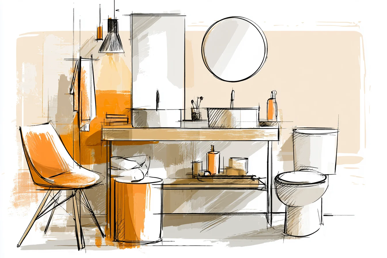
Then it was time for the fun stuff. I went with matte- black tap fixtures for everything – sink taps, shower head, towel bars, etc. Yes I realise matte black is super trendy right now and may end up looking trendy vs. timeless in a few years; but hey, they take photos well and more importantly, don’t leave water marks like the chrome ones do!
The rainfall shower head is huge and boxy and makes you feel like you’re staying at a high-end hotel. Having the basin taps go through the wall was annoying because I had to hire a plumber to come put the plumbing through the wall (ugh hello homeownership problems), but it really frees up a ton of space around your sink and creates such a clean, minimalist look. For storage, I found this adorable black metal medicine cabinet with mirrored doors.
Painted the inside white so when I’ m groggy-eyed and searching for ibuprofen in the middle of the night I can easily see where everything is. The vanity underneath is also white with black hardware to continue that balance – didn’t want it to feel too dark and ominous. Under that I added a thin quartz countertop with another black mat finish bar tap.
Since its going to be so dark with the black countertop I wanted to bring some warmth by adding an off white spray tap. Lastly, the lighting. DON’T SKIP ON GOOD LIGHTING.
It was probably the hardest thing for me to figure out. Initially I had 2 black pendant lights hanging from either side of the mirror that looked SO good at the store but COMPLETELY failed in real life because they cast shadows where I needed lighting to do my makeup or for Danny to shave without looking like he fended off a bloody battle. I switched those out for 1 large, black vanity light that spans across the mirror and added a second, smaller pendant light for when I want moodier lighting above the tub.
As for accessories, I keep mine pretty neutral but switch them up every once in a while. Sometimes I want super sleek and go with polished chrome and glass pieces. Other days I want warmer brass and marble.
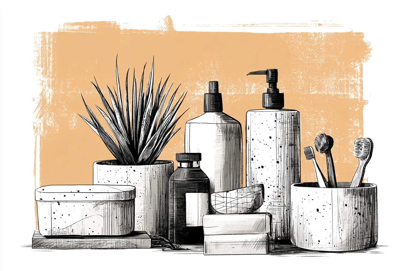
Lately I’ve been obsessed with these marble soap dispensers in white with black writing on them and love this black leather tray I keep cotton balls and Q-tips in (also hides all the different sized containers that seem to multiply when you leave the bathroom). Our bath towels are white waffle towels – they last WAY longer than non-waffle cotton towels and feel so much softer. – and I added black trim to spruce them up. Add plants to any room to make it feel like a home.
I have this snake plant on my windowsill because they love humid rooms and it gives the bathroom that *only* splash of colour. Sometimes I treat myself to white orchids from Tesco when they’re on sale, but for now I love keeping my bathroom strictly black and white. The best part about creating a strong base with your black + white scheme is it’s so easy to change up your design without having to start from scratch.
Want to add a pop of colour? Throw in some navy towels or a fun shower curtain. Feeling extra minimalist?
Clear everything out except the necessities.

Want more texture? Add a jute bathmat or woven storage baskets.
I’ve tinkered with designing a black + white bathroom for years now and have learned that timeless doesn’t have to mean boring. It means every single piece you bring into that bathroom should earn its place. Those hexagon tiles?
Earned their place by being a classic, but also functional and hides stains like a dream. Subway tiles? Earned their place by being affordable, easy to clean, and works with every type of design.
Matte-black tap fixtures? They earn their place by looking sleek, but also not showing water marks. You don’t just throw in pieces because YOU LIKE THEM.
Every.single.piece needs to be functional and bring something to the space.