We’ve all stood in someone’s beautifully appointed hotel room and immediately thought “GOD I WANT TO POOP IN THAT POOL.” For the longest time, I thought the secret was granite countertops and designer light fixtures. Having painted every bathroom in my house (yes, every single one) by myself, I’ve discovered the true key to the perfect bathroom colour palette: grey. Not builder-grade-beige disgusting, and not ultra-bright-white-every-flake-of-soap-scum-is-visible gross, I’m talking about tastefully swirled grays.
Grays that make poor lighting choices look like curated statement pieces. I should have known better than to try grey on my own. When we bought our house, the first thing I did was paint our first guest bathroom what was supposed to be a soothing warm grey.
It. Was.
Not.
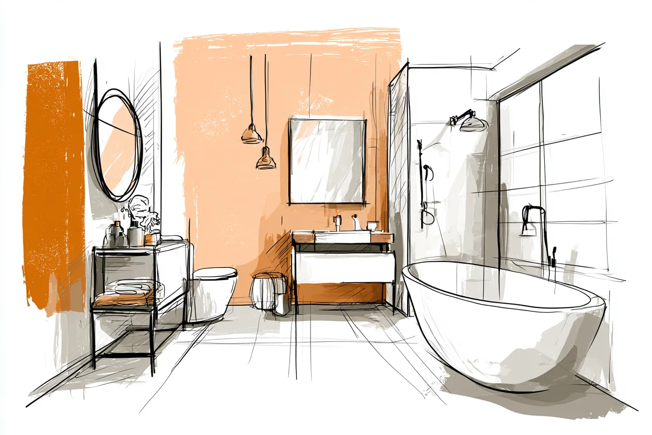
As soon as that paint dried, I knew I had made a grave mistake. This was not the soft grey that beckoned me into bathrooms like a verbal handjob as I held my shampoo bottle. This was HOT PINK.
EVERY MORNING WHEN I BRUSHED MY TEETH I LOOKED LIKE I WAS DYING OF SOME SORT OF VICTORIAN WASTING DISEASE. Chris swore it wasn’t that bad as I looked at him with the life completely drained from my face. He just wanted me to stop crying so he could go paintballing with his buddies that weekend, am I right?
At forty-seven dollars a gallon, that can of death taught me a lesson I’ll never forget. Grey paint NEVER actually says grey on the tin. Always.
Every single grey paint colour has something else lurking underneath. Blue grey. Green grey.
Purple grey. (BLECH) Brown grey. Pink grey. Get my point?
Buyers typically gravitate towards grey because they think it’s neutral AF, and then they can’t understand why their bathroom looks sad and bureaucratic. “It’s SUPPOSED to be grey,” they cry as I gently explain that grey comes in a bajillion variations all teasing out different colours underneath. My current bathroom boasts not one, not two, but THREE different shades of grey. I get stopped ALL THE TIME about how pretty it is, and who my designer is (HA!).
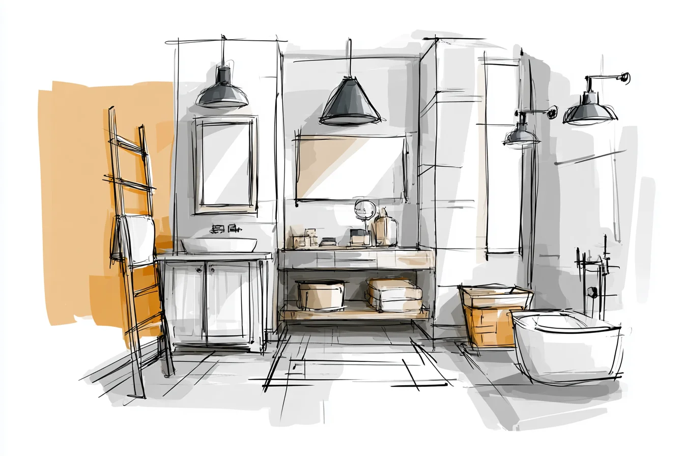
The walls are what the paint can branded “Dove Grey” but is truly more of a mushroom grey with subtle brown undertones. The vanity is Benjamin Moore’s Farmhouse grey (you may recognise it as Farrow & Ball’s Down Pipe). It’s a dark charcoal grey with blue undertones.
Don’t freak out about the price, I spent about as much on the paint as I do on a car payment but hey. It looks nice. The floor is actually a warm grey-toned limestone with just a hint of taupe mixed in.
What I didn’t understand when I painted my bathroom hot pink was that warm grays (grey with brown or beige tones underneath) are THE BEST option for not-so-well-lit bathrooms. Cool grey paints (grey with blue or green tones underneath) can appear dirty or drab when you don’t have natural light pouring in. That’s not to say you CAN’T use cool grays in low-light spaces, but there are definitely tricks to making it work.
Warm/cool grey advice: Play around with your warmer grays and cooler grays on different surfaces. Cool grey walls with warm grey cabinets (and vice versa). Warm grey tile with cool grey walls.
Something about the contrast keeps your eyes from getting frustrated that everyTHING is the same colour. Take your base colour into consideration when you’re picking your whites. If you’re going warm grey, go with creamy whites or off whites for your trims and accents.
If you go with cool grey, pair it with bright white paint. Once I paired cool grey walls with cream-coloured hand towels and it made the towels look dirty and the walls look blah. They fought each other and it was gross.
You Might Also Like
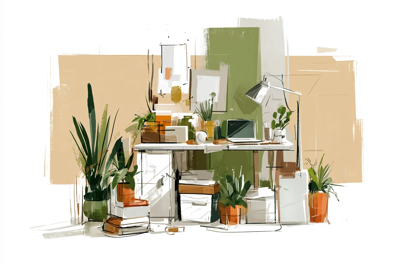
FYI – if you have brass hardware and fixtures like I do, cool grays pair DANGNNNN well with those. There’s a reason brass is having a moment right now. DON’T BE AFRAID OF IT.
When we moved in, all of our fixtures were chrome. Last spring, we took an entire weekend and replaced all of our hardware with aged brass pieces. It was a pain and way more expensive than I wanted to spend, but holy crap does it make a difference.
Chrome fixtures can look really sharp with grey bathrooms too, but to me brass feels more luxurious. Pair grey with unexpected colours. Deep navy blue is magical with medium grey.
Pair them together and it instantly elevates your space to hotel status. EVERYONE THINKS YOU PAID A DESIGNER. Our powder room is currently painted charcoal grey, and I threw navy hand towels and a framed mirror in the space and HOLY GRAIL.
People LOVE it and constantly ask who my designer is. Spoiler: it’s me! Same goes for green.
Sage works beautifully with warm grays. Deep emerald with your coolest grey gives your space a rich, expensive feel. I once paired forest green with a brown grey and it made my bathroom look like I worked at Murder Ridge hunting lodge.
Not BAD but not the cozy chic vibe I was going for in my upper middle class Atlanta suburb. Texture. Wait.
What? As soon as I stopped trying to find every colour that “went” with grey and started mixing different textures that were in the same colour family, my eye was BLOWN. Grey baseball jersey knit rug?
White linen shower curtain. Quartzite countertops. Charcoal textured tile.
It’s like the opposite of matching outfit. You wear all black all the time, but everytime you wear it YOU CAN CHANGE UP THE TEXTURES. Grey + White + TONS of Texture = Magic.
Storage is also tricky in a grey bathroom. Because most of your decor and accents will be similar toned greys, whites, and blacks, things can start to disappear into your lovely colour palette. I like to use woven seagrass baskets in cooler grey bathrooms and dark wood toned baskets in warm grey rooms.
Lastly, speak up about your vanity lighting. OH. MY.
GOD.
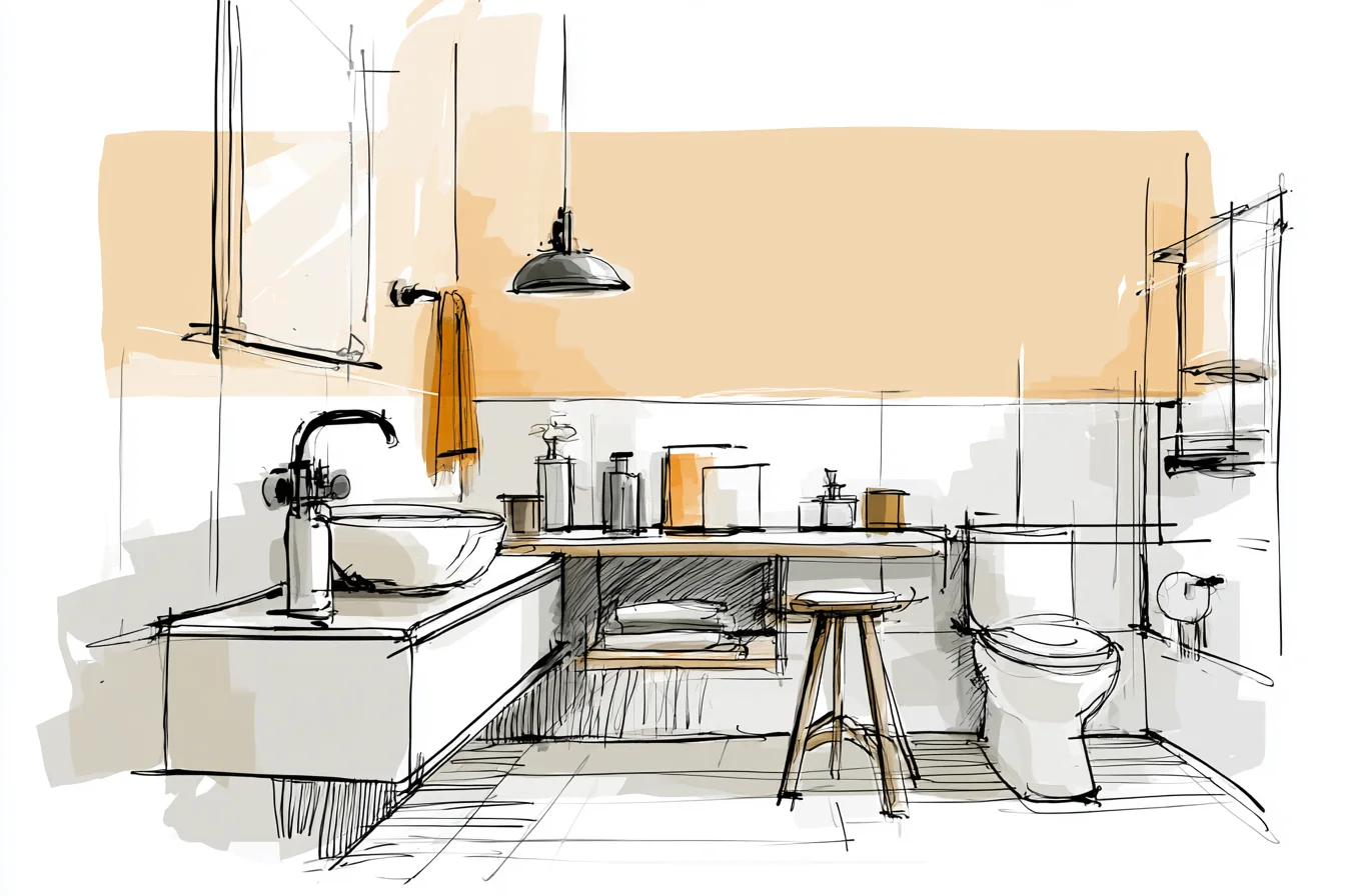
Why do so many vans come with these horrible strip light fixtures??? They suck.
ALL OF THEM. Get ones that shine up and down. Even better if you can swap out the bulb for a warm LED light instead of the bluish-white daylight ones.
Grey is meant to be played with. Don’t be afraid to shake things up if you’re bored of your space. We’ve had basically the same grey palette for THREE YEARS now, but by simply switching up shower curtains, towels, and rugs I can make it feel SO different.
That’s luxury. Being able to switch up your style without having to completely revamp EVERYTHING. Lesson learned from my mauve quarantine palace.