Ok so in many ways, I think everyone telling me their opinions about my bathroom remodel was right – black and white is “timeless”, and it IS “safe”. But I also think people tend to forget that black and white can be… kind of boring. That was until I stumbled into my sister-in-law’s downstairs bathroom one day last Christmas.
And BAM. Mind blown. Black metro tile from the halfway point of the wall all the way down to the base board, white tile above it, her new tap she installed, and an antique-y mirror.
It literally looked like something out of a magazine. Chic.
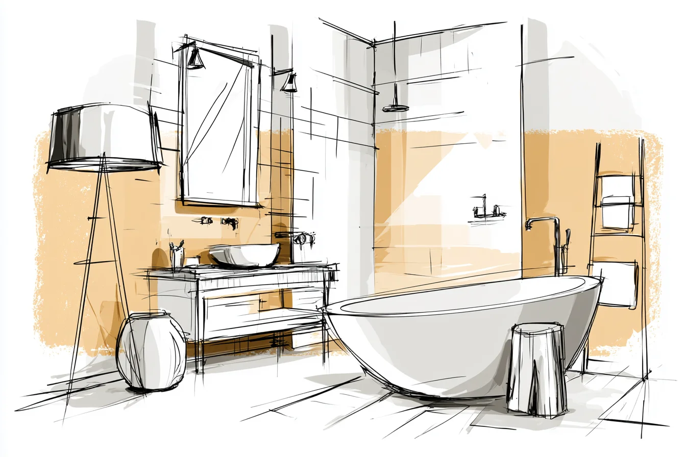
Dramatic.
Far from boring. And that’s when I realised … this colour combo is not as basic as everyone tries to make it seem. Sure it can be safe, but it is actually hard to execute nicely.
My initial idea for our bathroom was truly a snooze-fest. Plain white walls, white toilet, black hand towels, and black window treatment. Pretty much the exact opposite of what you should see when you walk into someone’s home, but straight UP WHAT YOU’D FIND IN A RENTAL THAT WAS TRYING ITS BEST NOT TO OFFEND YOU.
It was okay. When you’re doing your own thing with your own money you tend to let “good enough” be good enough. But that ended up feeling lazy to me.
Like I didn’t care enough to finish the look. It didn’t take long before I over did things from there. I painted 3 walls this super cool grey colour, kept the white toilet since we couldn’t replace it when renovating, and added A TON of mood lighting.
Oh my taps was it Instagram worthy. HORRIBLE FUNCTIONALLY. I couldn’t put on my makeup with enough light to see.
Trying to confirm Amara wiped all of her teeth off her face successfully became a serious game of minesweeper. But PICTURE GOOD. Let me repeat that.
If it’s good for pictures, but you hate spending time in there… you’ve failed. Somewhere between lazy and laying-it-all-on-there I stopped looking at black and white as just two colours to work with and started to look at them as ingredients. Similar to my cooking philosophy – the best foods have some sort of contrasting aspect to them.
Sweet and salty, crispy and smooth. You get the point. Applying that to our walls and accessories, it was less about black AND white, and more about how to layer them correctly.
Pattern mixing was my ah-ha moment, but I was so scared to try it at first. What if it looks sloppy?! BUT that’s the thing.
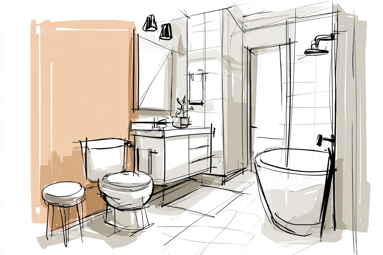
You have a certain safety net with black and white being such neutral colours. I ended up with hexagon floor tiles, black and white stripe towels, and some vintage inspired wallpaper with teeny tiny flowers behind the sink. With the correct colours, all of these patterns tied together because they balanced each other out instead of competing.
I learned that lesson when I ordered $250 worth of all WHITE everything (towels, bathmat, shower curtain) because I thought it would look “minimal” and “clean”. Um no – what I actually created was incomplete. Like I ran out of money or inspiration.
Sometimes taking the safe route is actually the worst route you can take. You’ll notice we have those hexagon shaped tiles on the floor with black around each tile, the vertical subway tiles in our shower, and that cute wallpaper behind the sink. By using different patterns on both different shapes/scales it really added a sense of rhythm that flowed throughout the entire bathroom.
I don’t know how else to put it other than… it’s like auditory stimulation but for your eyes. *inserts excessive eye-rolling here* One of the biggest parts of this remodel was adding texture. When everything is either shiny or smooth it can create a sterile vibe, especially when working with black and white. Throw in some woven storage bins from IKEA, a thick bath mat that actually stays put (#blessings), some reclaimed wood shelves that Liam’s dad helped me hang, and switched out our chrome taps for matte-black ones.
All of these small-textured differences between shiny and matte finish made our bathroom feel like a place you’d want to live in and not just take pictures for. Let’s talk about lighting. DON’T DISCOLOR YOUR FIXTURES!
You Might Also Like
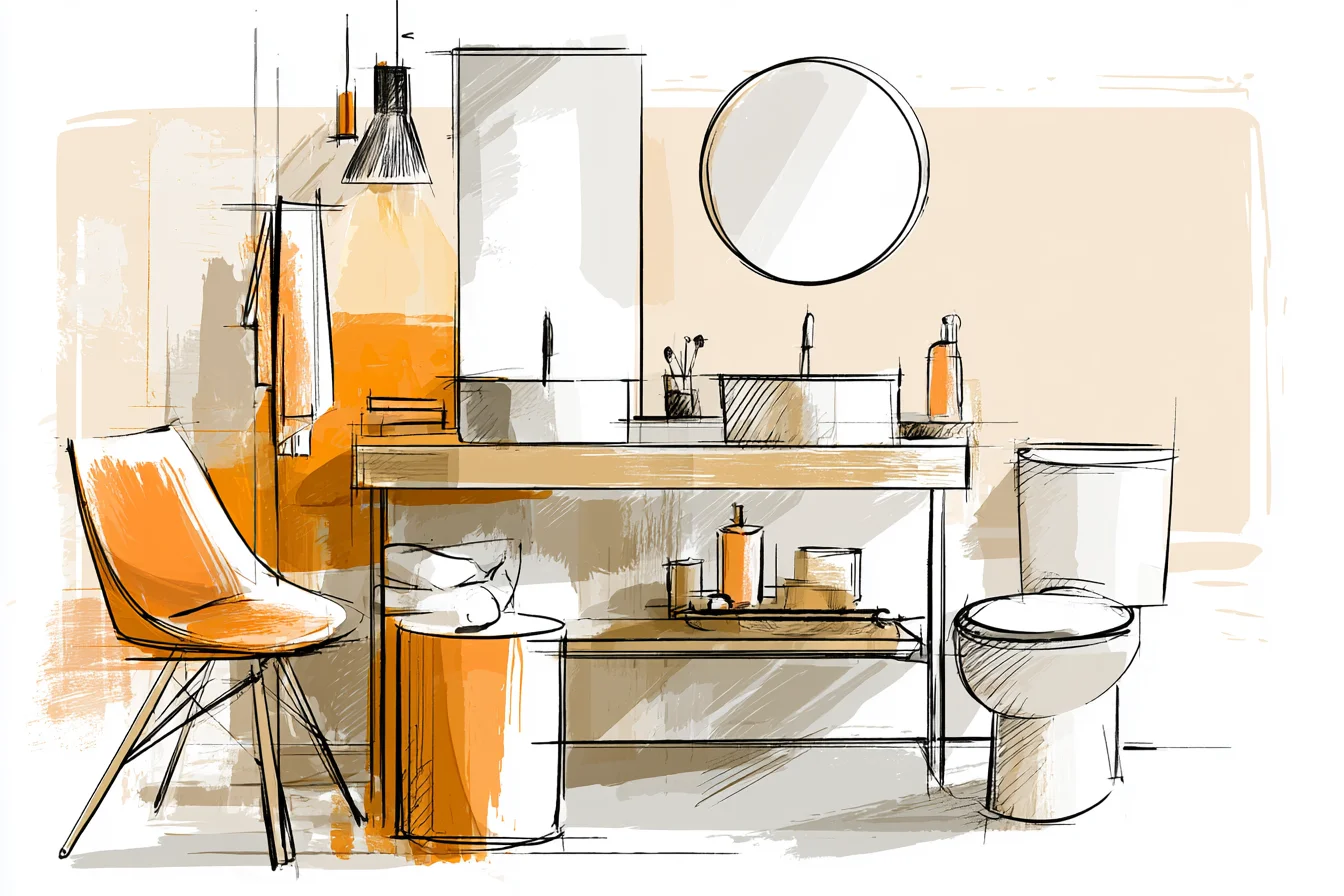
I cannot stress this enough. Bright white light shining down from the ceiling makes black accents look dirty and foreboding and white vanities look like something you’d find in a doctors office. Duh.
Dimmer switches were $50 from Home Depot and the best investment I made in this entire house. Seriously. I also picked up some LED strip lighting to mount underneath the shelves we installed for “ambient” lighting.
There needs to be multiple layers of lighting at different levels: main lighting for cleaning or showering (Amara, once she learns how) brighter lighting for getting ready in the morning, and dim/off lighting for nighttime and relaxing after the baby is asleep. Side note: you can still bring other colours into a black and white room. It just helps to have accessories here and there that aren’t cold or sharp.
For instance, I love keeping eucalyptus branches in a black vase (they smell like lavender for those of you who don’t know) because they bring a soft green to our room and doesn’t quite match anything else. Same with having white orchids on our windowsill when I actually remember to water them. Or swapping out our pure-white hand towels for this greyish-white option.
It’s WAY easier to not see toddler handprints with this colour! Investing in the right materials was huge. As my mum always says, “You get what you pay for”.
But in all seriousness, boring white plastic looks cheap; ALWAYS. But good white ceramic, painted wood, or nicely thought-out tiles really bring your space to the next level and show others you didn’t just rip the pages out of a kids bathroom decorating book. And with black – if it can chip or fade, you will hate yourself later.
Case and point: we got this adorable black shower caddy that ended up having white scratch marks all over it after TWO WEEKS. So now I spend more money on the black items knowing they’ll last vs. spend less on things I know I will stress about. As for storage, since you pretty much see everything in this room you want your storage containers to blend in.
Clear containers look too medical, and coloured containers just stick out like a sore thumb. We found these vintage-y black glass jars for q-tips/bath goodies; white ceramic containers to store other random items; and these woven baskets to hide things we don’t want to show. Pick things that flow together instead of matching, if that makes sense.
P.S. Another thing I didn’t think about was the ceiling. Yep, you read that right.
Painting your ceiling white gives you a blank canvas when it comes to decor, but there is no wow factor either. We painted our ceiling the exact same colour as our vanity (pale grey) and it really adds something extra to the room. Bonus: it actually makes our small bathroom feel bigger because there is no straight line where the wall stops and ceiling begins.
Maintenance. OH man, white walls and black counters show EVERYTHING. With a toddler that likes to smear sunscreen all over herself before taking a bath AND a baby that thinks wiping her mouth = licking it clean I clean our bathroom WAY more now than when we didn’t have anything but white carpet.
But! It doesn’t take long at all. I run around with a microfiber cloth every morning for ~30 seconds; it’s so much quicker than the ‘hours I don’t want to spend cleaning my bathroom’ I used to put off doing.
One last thing I love about black and white is that it *can* be timeless, but that doesn’t mean you shouldn’t have some modern tricks up your sleeve. Some recent trendy items that I don’t think will be crazy in a couple years are matte black hardware (like our new tap), unique mirror shapes (we hung some round ones above our sink) and fun patterns that aren’t cheesy. If you’re wanting to tackle this look in your own home I’d start with what I consider the “big boys” of the room.
The walls, floors, and main fixtures. Lay those out in a way that will work with your space and lighting. Our bathroom has direct sun light from the North windows, so I used more white than I normally would have to keep it from looking like a cave.
From there you can start layering in your patterns/ textures/ and bring-in some subtle warm colours.
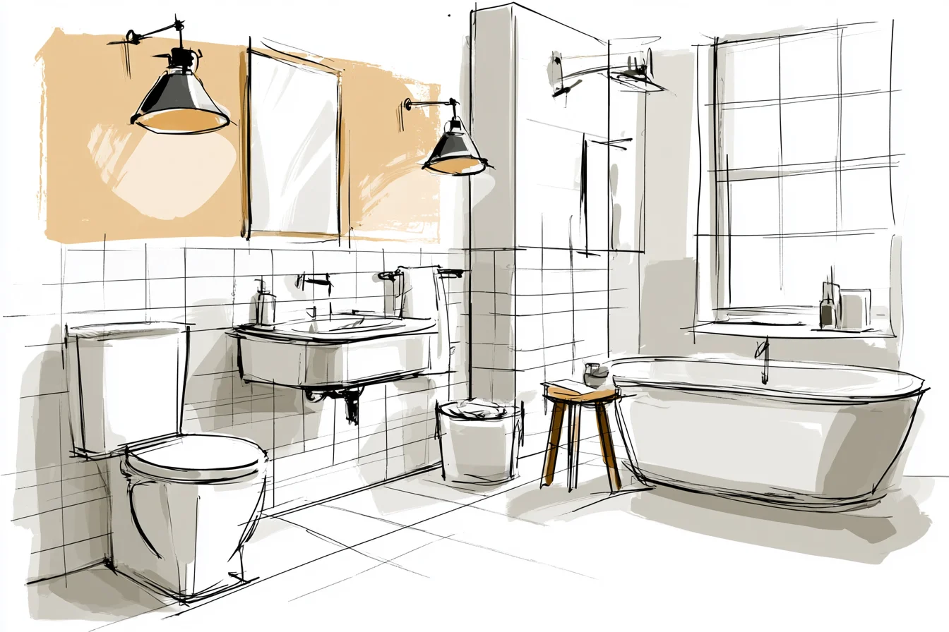
It’s those extra pieces that are overlooked that can make or break your space from looking curated vs. something you picked up at Target. Go into this project with the end in mind.
You’re not decorating for other people you invite over, you’re decorating for you and your family to live in. So while having a Pinterest worthy bathroom is nice, your goal shouldn’t be perfect. Ain’t nobody got time for that with toddlers + another baby on the way LOL.
Your goal should be to create a space that looks put together, but also feels comfortable. Something that’s timeless, but not stuck in the past. Fun, but not ridiculous.
A bathroom you’re wanting to spend time in, and not just taking instagram worthy pictures in 😉 PS. Once you have that right balance of classy and cozy…. you may find yourself spending way too much time in there. Hey, even when I’m 7 months pregnant and can’t bend over to poop without wanting to cry… this bathroom is sometimes the ONLY place that feels like we don’t live in a playground.