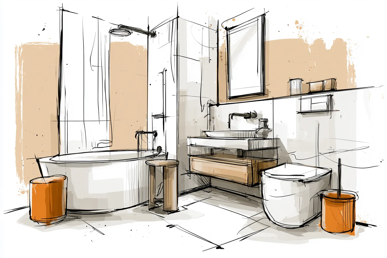
Picture how you feel walking into a bathroom that’s so white, so minimalist, so sterile, that you expect to see Matrix-alerted nurses bursting through the door at any moment. Yeah. Imagine doubling that.
That’s what I did. To my own bathroom. Two years ago.
Nice one, Marcus. See, up until that point I’d done absolutely nothing to the tiny washroom we had in our flat.
Teaching means you come home shattered so the last thing you want to do is spend your evenings thinking about bathrooms.
But our bath hadn’t escaped ire completely. The previous owner clearly had a “love” of decorating, but everything they did I hated. Peachy-pink ceramic sink suite that screamed “DON’T TOUCH ME I’M FROM THE ERA OF MAJOR”.
Needless to say I got pretty angry one day and decided I’d rip the whole lot out and replace it with… white. That’s right folks. TOTAL WHITE SPACE.
All white walls. All white bath suite. ALL WHITE.
Just kidding…sort of. Let me back up. I’ll start at the beginning.
Because this feels like quite the journey tale. Like I say, I’d avoided our bathroom for…God knows how long. One day I snapped, marched out to B&Q and returned armed with the bog-standard white emulsion they sell.
Three coats later I stood back and admired my work. “Bloody minimalist heaven” I said proudly as I turned to my girlfriend only to be met with the words “It’s just like the toilets at my school.” Fantastic. Thing is, it wasn’t the white that was the problem…it was the lack of texture. Every flat plane just sat there, refusing to give your eye somewhere to focus.
Lifeless. Flat. Clinical.
Pure repulsion. I was stood there sulking about my lack of style when it occurred to me that texture was actually the thing I should’ve focused on right from the start. Let’s rewind.
First thing I did was chuck the white shower curtain out. Ours had a few weird stains that were never going to go away (trust me, I looked into it) so we needed a replacement anyway. Decided to treat ourselves to something a bit nicer than the thin plastic’av we had.
Picked up this cotton waffle- weave number from John Lewis while they were on sale. Sure, it’s more $$$ than a basic shower curtain but teacher wages aren’t great, and it made SUCH a difference. Suddenly those glorious white walls had something for them to play with, some contrast to grab your eye.
Specks of light bounced off those little squares just enough to give some subtle shadows across the room. It wasn’t perfect but it was a start. Little things like that shower curtain made me start looking at the surfaces in there.
Everything was flat. White walls. White bath.
The arctic ice queen that is our mirror. Even fuck sake the towel rail was just a plain chrome bar from ceiling to sink. SO FLAT.
The next step was to attack those flat surfaces with actual texture and detail. Still no real cash to overhaul the whole room so it was a case of looking around for bits I could change that didn’t cost a million quid or some serious DIY surgery. Swapped out the existing medicine cabinet for one with beveled edges.
Easy change that cost about £40 from Wickes. Tiny detail but those soft edges threw enough shadows around when the light hit it to make all the difference. Flushed out those boring-as-fuck plain chrome cabinet handles for some brushed brass ones with a hammered texture finish.
Again, not shiny enough to look cheap but warm enough to make the whole room feel less cold and clinical. Oh god, white paint. Don’t even get me started on white paint.
Sure, it sounds super plain, super boring but here’s the thing. White paint isn’t WHITE. There are about a million different off-whites to choose from that all look completely different depending on what kind of light you’ve got in your bathroom.
Ours faces north so it doesn’t get particularly warm light throughout the day. Add to that the fact that my original “white” was actually more of a blueish-white and boy did that amplify the whole arctic feel I was going for. Cut a long story short, I did some serious internet homework before finally getting my head around that you don’t want THE white.
You Might Also Like
You want your white. The white that suits your space, that suits your light. Literally spent hours trawling paint colour charts online until I found THE ONE.
Got a tester pot and got home from work one day to find my girlfriend matched FIVE different “white” paint samples up against each other. Ended up going with this mostly-white, slightly-cream hue from Valspar. It sounds so dramatic but as soon as I hung that new mirror frame up, I could literally see the difference.
That extra cream actually made everything else in the room feel warmer. Throwing paint colours around at this point, I got my next breakthrough when it came to materials. Stuck a small wooden stool next to the shower for extra storage.
Painted it white, yes…but used a paint that allowed some of the wood grain to show through. Those tiny little imperfections were enough to finally give my eye something interesting to look at that didn’t just vanish into those big white planes. Followed that up with these ceramic soap dispensers I found in TK Maxx.
Matte finish and they feel like little smoothed stones in your hand. Technically they’re still white. Fits the colour scheme.
But that slight texture again just makes the whole room feel less…manufactured. Hell I even got smart with the plants. Started off going down the snake plant route but they looked way too big for the space.
Imagine dropping a bloody gorilla into a phonebox. Tiny. What DID work was this simple pothos plant in a white ceramic pot with proper drainage holes.
That trailing green was enough of a contrast with all the white to work perfectly and it actually loves the humidity too. Score. Another thing I wish I’d known about sooner was lighting.
Original setup was just your bog standard overhead thing that every hospital slash IKEA showroom uses. Harsh shadows everywhere. Added a small battery-powered LED strip under the cabinet that floods the room with warm light and suddenly all those white walls popped.
Went from harsh bright white to creamy light. GAME CHANGER. Something else I only truly understood once I got into it was paint finishes.
Went flat for the walls because it was cheapest but holy hell is flat paint a nightmare in bathrooms. Marks, moisture everywhere. Still hate walking into there with sweat on my forehead.
High gloss was better on the durability front but made the room scream ice rink. Ended up going eggshell on the walls and semi-gloss on the woodwork. Tiny difference in shine but enough to create some definition without being TOO obvious.
Threw some white wicker baskets from IKEA on the floor for loose storage. Blows toilet rolls and any extra toiletries we have kicking about. Again, adds texture but still fits the scheme.
That white ladder-y thing you can see holding rolled towels? That was the last domino. Inspired by TikTok.
It’s NOT storage or extra drying space- It’s there as another shape to make your eye take in. Don’t be scared to use your decor as literal decor. FLOORING.
No way around it. Mine was by far the most expensive part of my overhaul but God is it worth it. Instead of purely white tiles I went with white subway tiles in a herringbone pattern.
Same colour but completely different look. Creates depth and visual interest but stayed seamless. Those teeny bevel edges on the tiles also capture light better throughout the day too.
White doesn’t just *have* to be white. Off-white.
Cream.
Bright white. Inch perfect blends of them all together. Layering different shades really is key.
Flat white next to pure white next to cream white gives your eye depth and tricks your brain into thinking there’s more complexity there than there actually is. It’s the white equivalent of someone playing a song you know bang on but in a different key using loads of different instruments. My final word of warning?
White doesn’t have to be cold. Or sterile. Our bathroom feels warmer than it did before I started.
Sure, it’s technically the same colour but adding that contrast with different textures, little differences in tones and playing around with light make all the difference. Give your eye somethings to look at within your colour palette.