I was precariously balanced on a rickety step ladder with a scraper elbow-deep in what appeared to be two decades’ worth of grout when my neighbour Claire knocked on the door. It was one of those “borrow some sugar” type neighbourly visits, so naturally she appeared at my door as I was ripping our bathroom apart. Again. “Crikey mate, you’re really ripping it out then?” she said as she stared at our naked plaster wall. “My auntie just had her bathroom tiled last week in this lovely mint tile.
Looks like something you’d see in those swanky hotel rooms rather than one of those avocado suites they used to have in the seventies.” That comment stuck with me. Me and Claire have chatted about house stuff quite a lot over the last few years so I knew she wasn’t talking about one of those glossy hideous greens that aging TV shows still persist in remodelling Victorian terraces in. What she was describing sounded nice.
Relaxing. But daring enough that I’d end up googling “how to paint bathroom tiles” in a panic two years down the line.
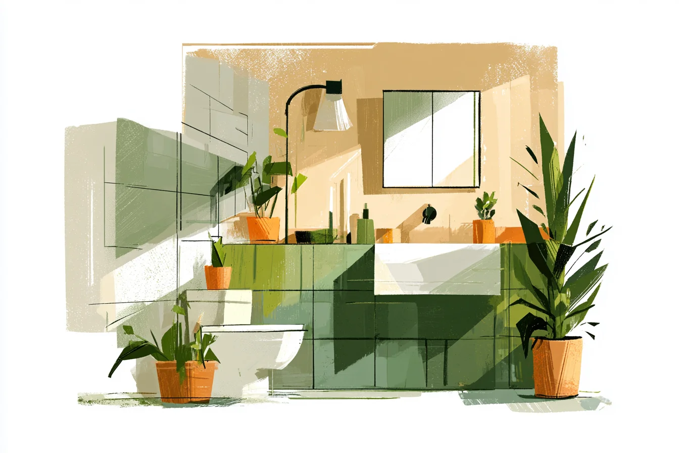
The thing was I’d sort of been planning on playing it safe with white subway tiles.
It is safe after all. Everyone does white. It’s clean and crisp and works with everything.
But green? That was a bit of a leap. That was veering dangerously into “bright orange textured tiles that I’ll hate in six months” territory.
Turns out I spent way too much time overthinking what colour bathroom tiles to get. Danny thought I was mental whilst I spent hours scrolling through pictures of bathrooms every evening after work like I was moving house rather than just changing the tiles in one room. Between you and me I did get way too obsessed.
My phone search history is full of ‘embarrassing Danny’ things like ‘sage bathroom tiles a mistake?’ and ‘will green bathroom tiles look naff’. I even got asked by someone at Homebase if I needed help because I was staring at the Farrow & Ball colour cards so long. Anyway, what I did notice whilst drowning in an ocean of tile-related internet content was that the bathrooms that stopped me scrolling and made me think “God I want that bathroom” weren’t pristine white walled boxes.
No, what I kept noticing were ones that had colour. Personality. Ones that looked like actual rooms you’d want to spend time in rather than sterile white boxes that look like hospital wards.
More often than not…they were green. Turns out green tile isn’t a wacky trendy new thing that everyone will hate next year. It’s just something that people did badly for a long time.
Avocado bathrooms suites? That was green tile gone wrong. But what we’re talking about now isn’t bright mad greens.
It’s cool, toned-down greens that are calming and alive all at the same time. Still, never one to dive into something head-first, I bought a single tile from the trade tile samples section in Topps Tiles so I could see it on my wall. Cost me £3.20 but I figured that was better than regretting buying hundreds of the wrong tiles.
It was this beautiful muted sage with grey/blue undertones that they hilariously called ‘Forest Whisper’ or something. Blu- tacked it to the bathroom wall next to the mirror and lived with it for three weeks. It honestly changed my mind.
When I was rushing to get ready in the morning and that tile was blasted with that cold white bathroom light, it looked almost grey. Not screaming-out-at-you-in-the-shop kind of green. Calming.
Then, as the bathroom filled with steam in the evening when we were taking turns in the bath, it came alive and became this gorgeous muted shade of soft green that made the whole room look bigger. Even sat under our rubbish ceiling light – one of those horrible builder-style spotlight things that make everyone look yellow – it looked fine. Three weeks of staring at that one solitary tile and I was sold.
Plumped for enough 150x75mm subway tiles to cover the area around the shower and wall behind the basin in the same sage green but from a different supplier. B&Q did them for £18 per square metre. Only about £4 more than their white ones.
Tried to upsell me textured tiles for £40 per metre at the tile shop but a) I’m not rich haha and b) subway tiles let the colour shine! Slapping them up was easy enough. Only really lesson I’d learnt was to go for grey-grout rather than white – Pete the tiler said white grout always looked cheap with coloured tiles.
He wasn’t wrong. Grey-grouted sage tiles looked expensive. White-grouted sage tiles?
Cheap and nasty. Every. Honestly though, it transformed the room.
You Might Also Like
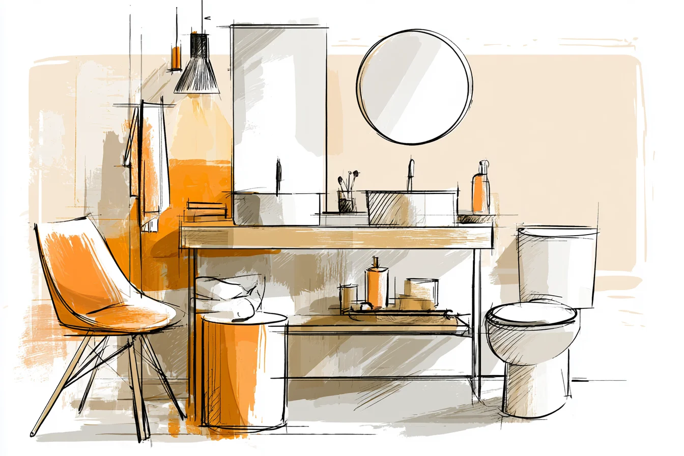
Where previously our bathroom felt sterile and lifeless – all white walls and bath and those ‘homely’ flat-pack fitting that look like something you’d buy in a chain hotel – it suddenly felt homely. Warmer. Less…clinical, I suppose.
Don’t mortgages scare you? It took people literally five minutes to notice. Mum commented on it when she was over.
Said it put some of the “posh” hotels she’d stayed at to shame. Danny’s sister, who works in interiors and is bloody clever at it, spent twenty minutes taking pictures of our bathroom to send to her friends. Couldn’t believe she wasn’t offended.
Even the plumber who came round to mend our radiator questioned us on where we got it from – his wife had been wanting to tile her bathroom in green but struggled to find the “right” one. There honestly is something to that “research”. Psychologically at least, it makes you enjoy spending time in there more.
Whether that’s because green is meant to be calming I don’t know. Or maybe it’s that it mimics being outside? But since we’ve had them, our bathroom doesn’t scream “oh god what am I hiding from my mates?” whenever we walk in the door like it used to.
Even just running your morning shower feels better. Less frantic. They’ve also been great from a practical point of view too.
Water marks from hard water (we have that annoyingly shiny pink stuff) aren’t quite as visible as they used to be on white tiles. Nor is soap scum and general bathroom dirt for that matter. Not that our bathroom is spotless or anything…but it doesn’t shout “LOOK AT ME!” every time you so much as breathe on them like it used to.
I’ve even tried it in other rooms since and learnt a lot about what shade to go for. Picked a darker forest green tile in hexagonal shapes for our downstairs loo. Matches the brass tap and wooden vanity unit we got superbly.
Looks very ‘boutique hotel’. …but then tried mint tile in a rental bathroom of a friend’s recently and it just looked cold. Institutional, even. Pedantic picked fault but the room had bad lighting.
No natural light and one of those hideous blue-white LED strips. Mood lighting I’ll have none of. Lesson learned there.
But my word of warning with green tiles is to stick with ones that have grey or blue undertones rather than yellow or brown. Obviously yellow-green tiles will look fine with brass taps like we have but yellower shades of green will always lean towards that institutional look. Go blue/grey undertones and you can match them with pretty much any metal finish.
We’ve got brushed brass taps and towel rails, but would look equally as nice with chrome or even black finishes. Also works beautifully with natural finishes like wood and stone – can’t say the same for a lot of coloured tiles. Obviously shade-wise it’s mega important you pick the right one.
Bought some stupid online for a friends en-suite as they sounded like they’d be perfect. Pale blue-green with white/tan speckles sort of thing. Looked dreamy on the website but y’know… got them and they were yellow-green.
Stood out so badly under artificial lighting it made the room feel unwell. Ridiculously expensive to return and reorder but lesson learnt – get yourself some real tile samples, not just the tiny meaningless chips they hand out in the shop. Get yourself full-sized samples and stick them on your wall for a few days.
Make sure you live with them and see them in natural and artificial lighting. When the room is steamed up and when it’s dry.
Spend a few quid up front and save yourself a fortune on regretting your decision.
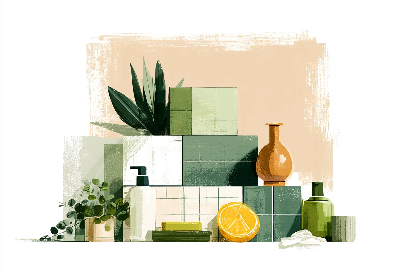
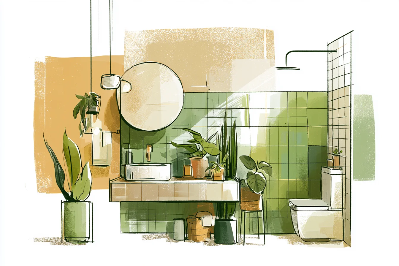
Another thing I didn’t expect? How much they’ve teamed up with our plants. Got a little snake plant sat on the windowsill and a trailing pothos hanging down from a ceiling hook and they honestly look like they were meant to be there.
Tile colour doesn’t fight with your plant colours. It enhances them in this subtle way that makes your bathroom feel more….natural? I honestly love our green bathroom tiles.
They’re not trendy enough that they’ll look dated in a year or two. Just…nice. Colours that look like the real world and remind us we’re humans and not hamsters living in some kinda clinical Pinterest box.
Plus, now I see our shiny blue-white taps in the mirror every morning as I brush my teeth, I’m constantly reassured with thoughts of “nah, we really nailed that tile choice”. Really, truly worth stepping out of your white-safety-zone for.