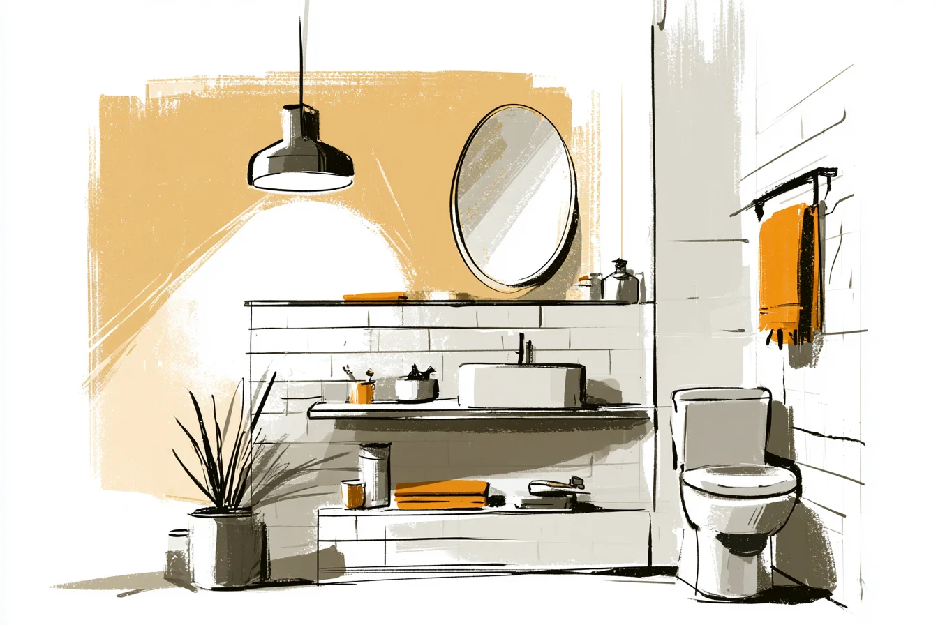
Fair enough. I’ll admit it. I’m a bit proud of my bathroom.
Ok fine. There I was, having my morning coffee and staring at my bathroom through the open doorway (I actually do this) and it made me happy. Not because it’s luxe or trendy – in fact the colour palette is literally just grey and white.
It’s probably the most basic colour combination possible. But after 3 legitimate tries and about half a year of living with what I affectionately nicknamed a “design crime,” I finally got it “just so.” We first moved into our teeny terrace a few years back and the bathroom was one ugly magnolia and brown colour palette that left you gasping for air every time you opened the mint toothpaste.
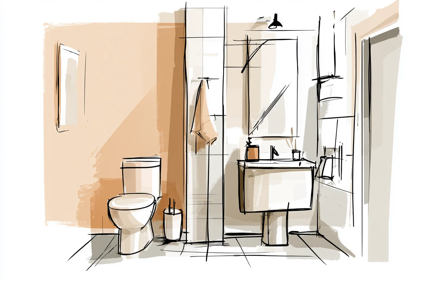
Standard rental outwardboundsment paint scheme, am I right?
Danny kept telling me we shouldn’t bother because we rent after all, but I just couldn’t take staring at sad boring walls every day. Plus I had binge watched dozens of YouTube videos on Pinterest about easy bathroom updates for rentals and was high on DIY potential. My first attempt at grey and white was horrendous.
Blah office lunchroom kind of nasty. I bought some sort of medium grey paint from B&Q – I can’t remember the name but it was called something along the lines of “Urban Jungle” or whatever other nonsense – and paired it with the brightest whites I could find. Seemed sleek!
Futuristic! What I actually got was hospital toilet vibe. And not like a posh private hospital.
More like the hospital you get rushed to when you absolutely need a hospital. It took me approximately two weeks of living with my amateur-design choices to realise that I had approached grey and white as if they were colours and not fifty different feels. That bright white was sucking the life out of my grey paint.
The grey made my white tiles feel unwelcoming. They were fighting each other every morning when I woke up. I tried again with what I will now call “not quite white,” you know when you look at a colour and it looks like white but then you look at actual white and realise it’s actually off-white with just a hint of warmth??
Found this colour called “Pointing” by Farrow & Ball but of course I couldn’t afford Farrow & Ball so I took the paint sample to Dulux and had them colour-match it for me. Saved myself £37 and had more money to spend on the fun things. Bam.
This time around I went WAY lighter on the grey. Much less “I live in a cement prison” and more “I like clouds WAY too much.” Found this beautiful warm grey that changes colour as the day goes on – looks like a cool blue grey in the morning, a straight grey at midday, and a lavender grey by nightfall. Isn’t science fun??
Learn from my mistakes, kids. Learn from my mistakes. I figured that out AFTER painting the whole bathroom though.
Lesson learned. But here’s the thing that changed it all for me – my first attempt was stripped back. All smooth surfaces and it felt flat.
Literally no personality, like the show room you would never want to invite guests to use. This time I mixed it up. Kept the walls neutral because YELLAWALLSPAIRWITHTHEBLEACHGRAYTOILETPEOPLE, but I added this gorgeous texture wallpaper with a linen texture on the accent wall behind my toilet.
You Might Also Like
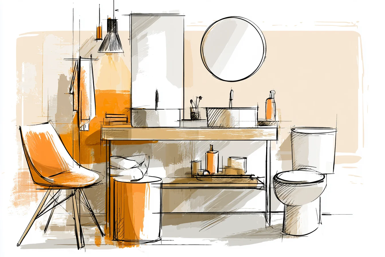
Cost me about £30 and I spent half of a Saturday morning applying it because I’m double emoji failing at measurements and only sticking once. The shower curtain was another huge mistake on my part that I ended up loving. Gone was the dreadful plastic curtain that came with the house, replaced with this cozy waffle weave fabric curtain from Dunelm.
The curtain itself is white but has a ton of texture so it feels purposeful rather than purely practical. Bonus? It doesn’t stick to you when you shower.
Always a win in my books. The floor was another challenge because I couldn’t exactly rip up the existing tiles. But low and behold I discovered these gorgeous peel-and-stick tiles that create a soft pixelated pattern – I’m talking less aggressive black and white checkerboard and more organic shapes in soft greys and off-whites.
Ordered them from a company online after way too much time scrolling through their selections. Applying them was oddly therapeutic once I gave up trying to line everything up perfectly. Storage was key with grey and white.
ANY sign of dust is amplified when your walls are white. That gorgeous white floating shelf I had to have? Became a shrine to every water droplet and rogue strand of hair known to humankind in less than a week.
These days I use baskets galore to hide the clutter. Scored these adorable woven rattan baskets at TK Maxx and they add texture without adding any actual colour you have to worry about. Lighting was pretty much the death of me.
I mean that dingy overhead light made everything look dull and tired – least attractive way to start your day when you’re half asleep and questioning life choices. Couldn’t change the wiring, obviously, but I could layer. Picked up this little LED lamp for the windowsill (yes, I KNOW you don’t “normally” put a lamp in bathrooms BUT IT HAS THE APPROPRIATE IP RATNG AND THE BATHROOM POLICE YET TO INDICT ME ON CRIMES.) I also got these battery powered LED lights to clip underneath the floating shelf for a soft glow in the evenings.
Did you know mirrors make a huge difference too? Instead of your typical builder-basic rectangle mirror I found this cute round one from a charity shop in Beeston – wasn’t anything special, maybe £15 but circles break up all of the sharp edges from the tiles and fixtures. Sometimes swapping out the “basic” comes in the form of small details.
Finally, houseplants were a lot of trial and error, err I killed.
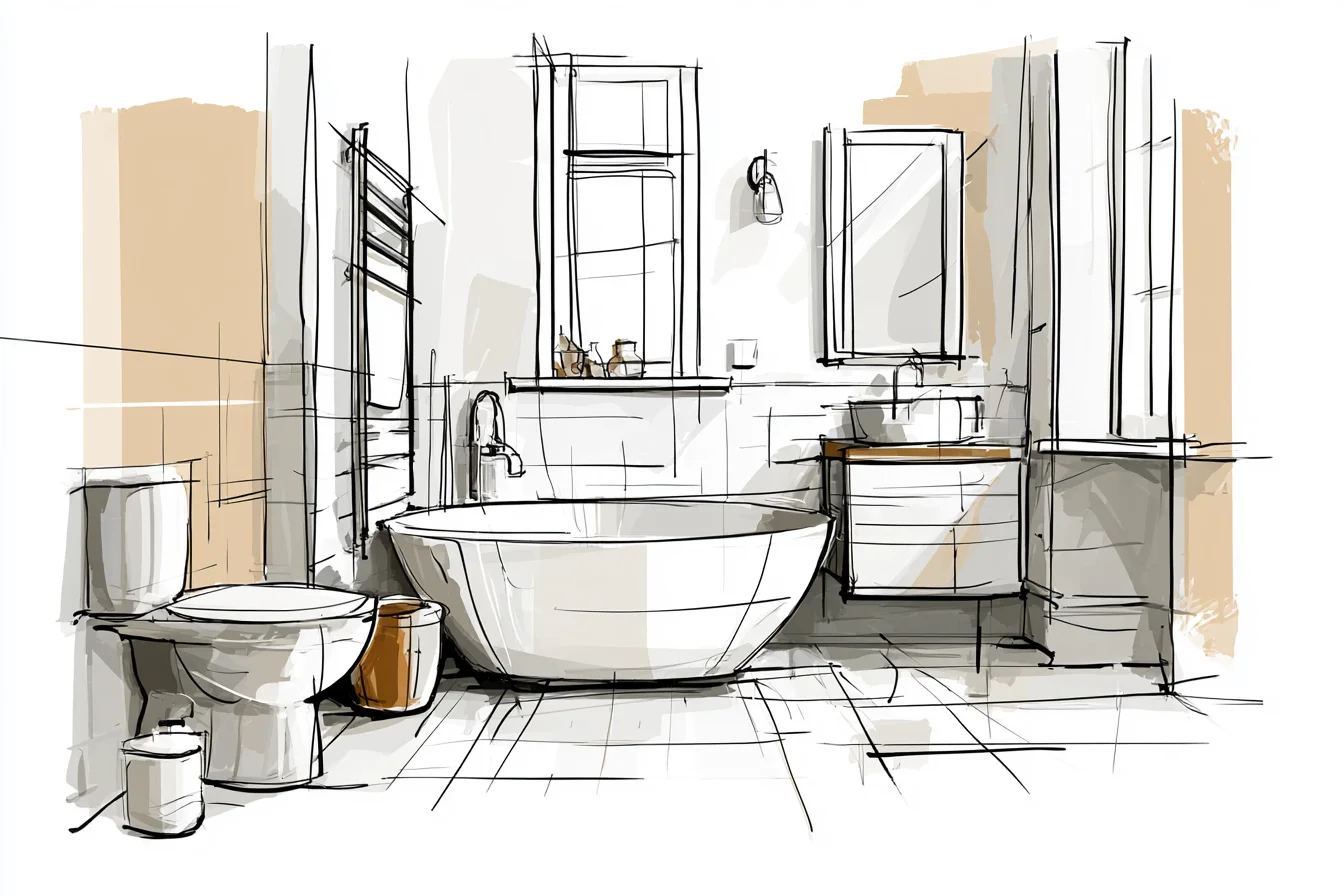
Dumped, dozens of innocent houseplants before finding ones that can handle Bath and Body Georama misters (apparently Pothos and ZZ plants are Gods-tier plants, they just sit there mocking you with their green alive-ness.) A few punches of greenery help the whole room from feeling clinical, but doesn’t overwhelm the palette. I stress-tested it by having my sister and her three kids stay for a week last May.
I mean don’t get me wrong, I KNOW you forget about your own house. But having people come over and use your washroom forced me to really take notice of the sanctuary I had created. How the morning light hits that textured wall JUST RIGHT.
How the “cool” grey actually makes the white feel clean, not sterile. How every piece complement eachother without matching too perfectly. It just….works.
My mum is forever telling me I should have just painted it “a proper colour,” she is currently fixated on this sage trend but man do I love my boring-ass grey and white palette more than I thought I would. It’s trying to say nothing. It just…makes you feel relaxed when you’re brushing your teeth and taking DAYM showers.
Shouldn’t that be the goal of good design?